This post was published 12 years, 1 month ago. Due to the rapidly evolving world of technology, some material it contains may no longer be applicable.
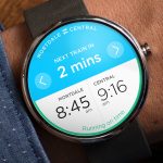
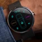
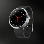
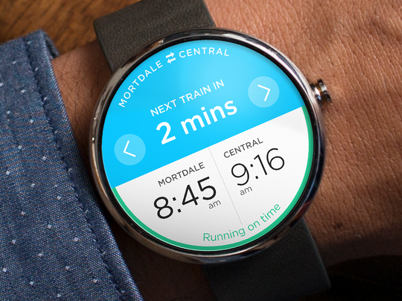
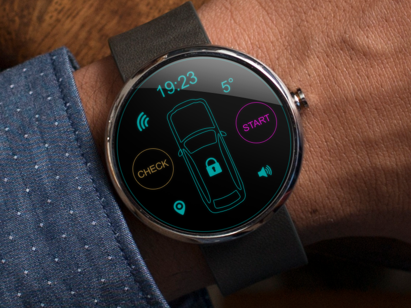
They talk about how designing the visuals for a smaller display was actually much easier than they thought. Because there isn’t a lot of room, you’re forced to keep things simple and clean. They also say that because the information has to present itself in such a way that it’s useful and intuitive, you spend a lot more time thinking about the design than you do actually designing it.
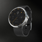
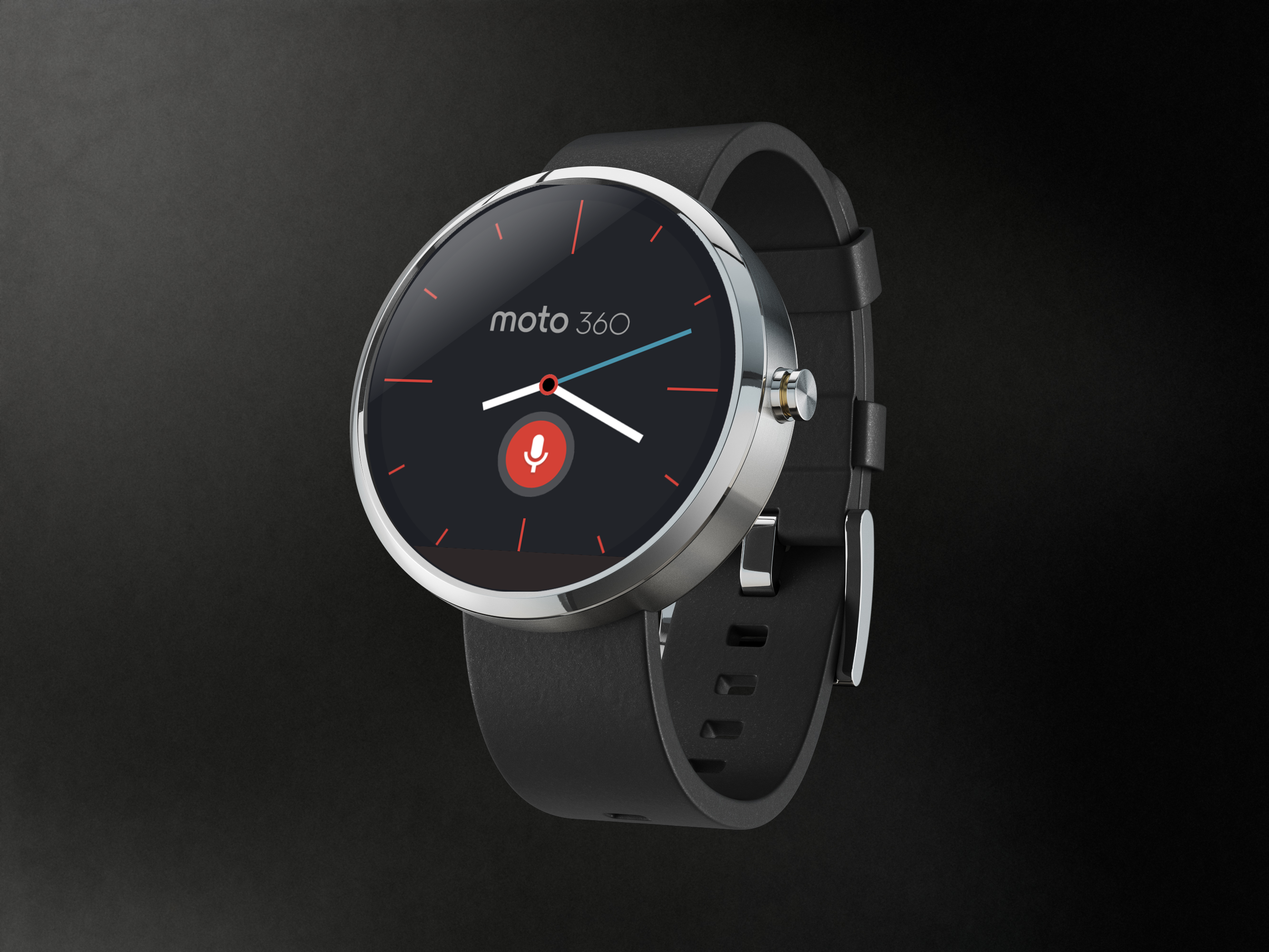
Another thing to note is that designing an interface for a round display was also much easier than they assumed. In fact converting their design from the G Watch display to that of the Moto 360 took less than an hour! This is surely something developers will be glad to hear, as it means keeping a consistent, user-friendly and clean UI will be extremely easy.
The mock-ups they’ve presented certainly look amazing, so here’s hoping that other developers will make equally beautiful apps.
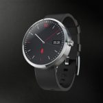
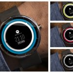
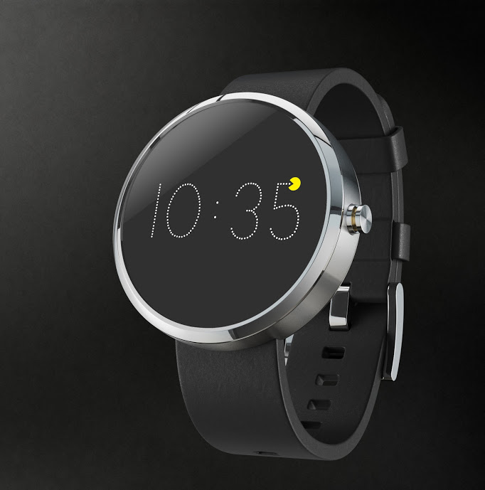
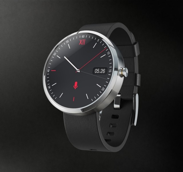
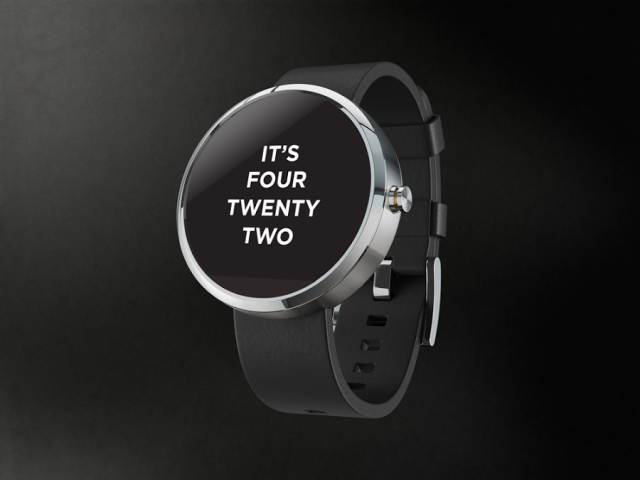
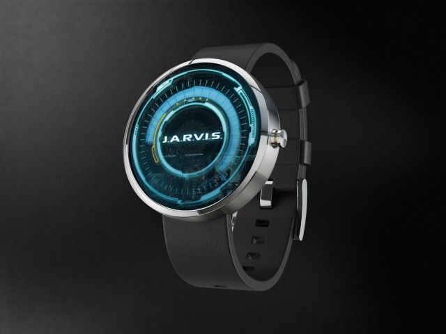
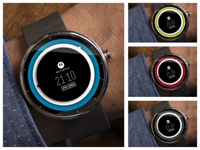
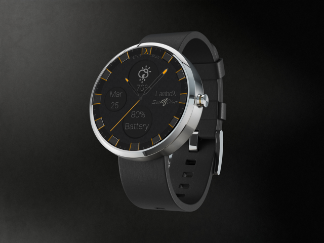
Motorola are also holding a design contest for the 360 – asking the Google + Community to design watch faces. Here the details along with some of the best designs so far.
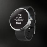
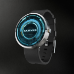
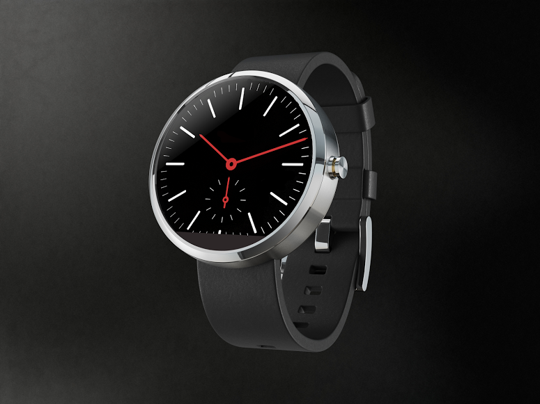
Thousands of watch faces have been submitted already and we would really encourage you to have a good browse (and perhaps even submit something yourself) as we have only included a small handful of some of our favourites here. Official PSD templates are provided by Motorola for those interesting in showing off their artistic skills. These will work in either GIMP or Photoshop.
Motorola will soon be choosing a short-list for people to vote on. The winner will win a Moto 360 while a handful of runners-up will get Google Play vouchers worth $50. If you want to enter you’ll need to do so quickly!
You can find the community below:


